XAML for beginner - Part 1
A few years back, Microsoft was betting on Windows Phone. Could you guess which language they use to develop apps for these shiny new phones? It’s XAML.
In this post, I will introduce the most basic concept of XAML layout, as well as how to use them in your personal project.
1. Two lines on History of XAML
XAML, aka Extensible Application Markup Language, was a nice replacement for Windows Form. Later, it was used for Windows Phone, Universal Windows Platform apps (the apps that run on Windows 8 and above).
2. Basic controls - Grid
In XAML, there are some basic controls that was use as a container for other controls, which is Grid, StackPanel, and ScrollViewer. I will cover the ScrollViewer at the end of this post.
A comparison as follow:
| Grid | StackPanel |
|---|---|
| The inner controls can overlap with each other | Inner controls stack horizontally or vertically |
| Inner controls can be arranged based on row and columns | N/A |
| The grid can be expanded to parent control | The StackPanel expands based on the inner content/controls |
Let’s start with a sample WPF application.
Open the file Window.xaml in your Visual Studio. Inside the outer Grid, add two TextBlock as follow:
<Window x:Class="WpfApp1.Window1"
        xmlns="http://schemas.microsoft.com/winfx/2006/xaml/presentation"
        xmlns:x="http://schemas.microsoft.com/winfx/2006/xaml"
        xmlns:d="http://schemas.microsoft.com/expression/blend/2008"
        xmlns:mc="http://schemas.openxmlformats.org/markup-compatibility/2006"
        xmlns:local="clr-namespace:WpfApp1"
        mc:Ignorable="d"
        Title="Window1" Height="800" Width="480">
    <Grid Background="Transparent">
        <TextBlock Text="Hello world" FontSize="50"/>
        <TextBlock Text="Hello WPF"  FontSize="80"/>
    </Grid>
</Window>
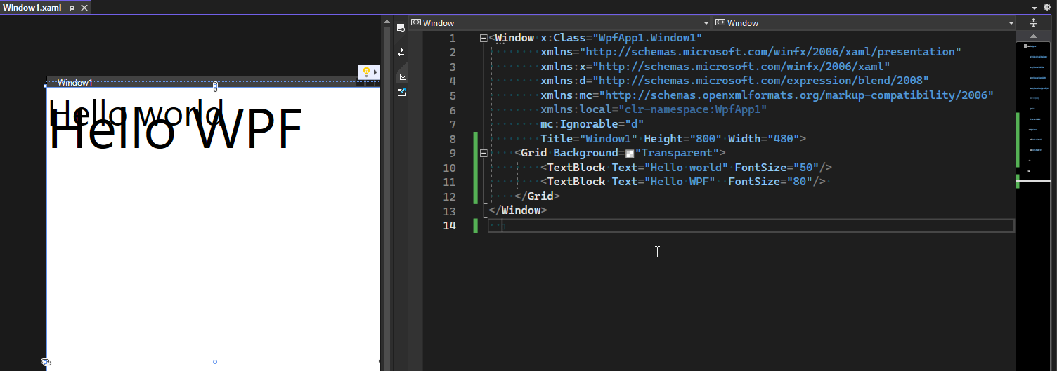
You will receive a layout with overlapped texts like this
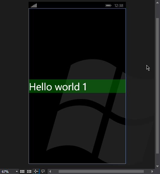
Overlapping contents allow you to design more sophisticated/beautiful app, for example:
2.1. Grid’s column and row
Grid allows you to arrange the content into columns and row. You can declare column definitions and row definitions. After that, for each child control, you can set column or row property.
<Grid Background="Transparent">
    <Grid.RowDefinitions>
        <RowDefinition Height="60" />
        <RowDefinition Height="80" />
    </Grid.RowDefinitions>

    <TextBlock Grid.Row="0"
               FontSize="50"
               Text="Hello world" />
    <TextBlock Grid.Row="1"
               FontSize="80"
               Text="Hello WPF" />
</Grid>
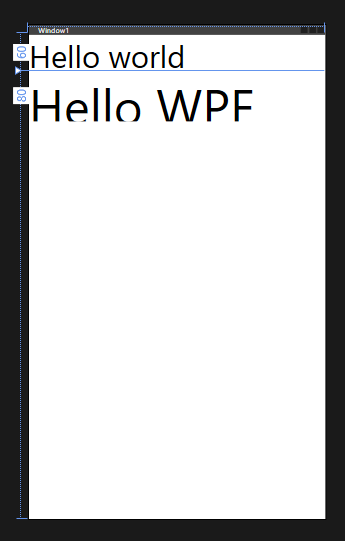
The textblocks are now arranged to rows accordingly
You can do the same for columns, or combine the rows and columns to have a table like layout
2.2. Row and column size
If you’re a web developers, at some point, you would need to scratch your head on how to make this div take up the whole space, or make it fit the contents, etc. TBH, it was never an easy task, consider that you might have a dozen of nested elements acts as the containers for the div element that you want to display on the screen.
Luckily, XAML solved this problem by 3 simple concept for height of rows and width of columns:
- Fixed size: The width/height is exactly what you declared
- Auto: The width/height is equal to the width/height of the content inside it
- Star: The width/height is expand to fit the remaining space of the parent control
- Number with star: Act as percentage. Useful for scaling
Let’s see them in action. The following code will give this layout
<Grid Background="Transparent">
    <Grid.RowDefinitions>
        <RowDefinition Height="Auto" />
        <RowDefinition Height="60" />
        <RowDefinition Height="3*" />
        <RowDefinition Height="7*" />
    </Grid.RowDefinitions>

    <TextBlock Grid.Row="0"
               FontSize="15"
               Text="Hello world" />
    <TextBlock Grid.Row="1"
               FontSize="80"
               Text="Hello WPF" />
    <Grid Grid.Row="2"
          Background="Green" />
    <Grid Grid.Row="3"
          Background="Blue" />
</Grid>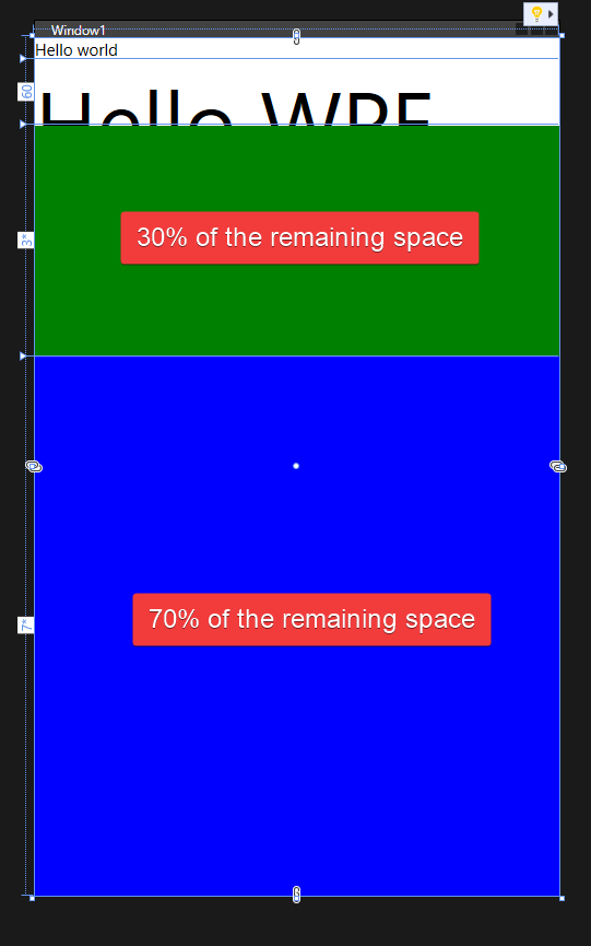
Obviously, you can nest multiple
Gridin a parentGrid
3. Basic control - StackPanel
StackPanel, as the name of the control, stack the content horizontally or vertically.
<Grid Background="Transparent">
    <StackPanel Margin="16">
        <Grid Width="80"
              Height="40"
              Background="Red" />
        <Grid Width="160"
              Height="40"
              Background="Blue" />
    </StackPanel>
</Grid>
By default, StackPanel is vertical
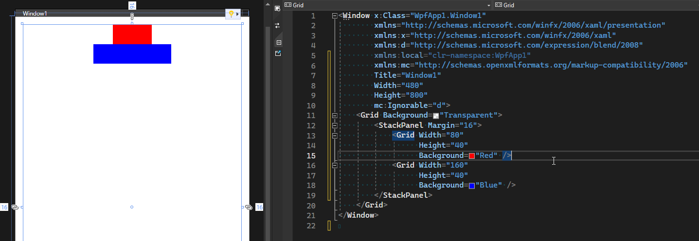
You can make it Horizontal by set the Orientation="Horizontal"

4. Basic control - ScrollViewer
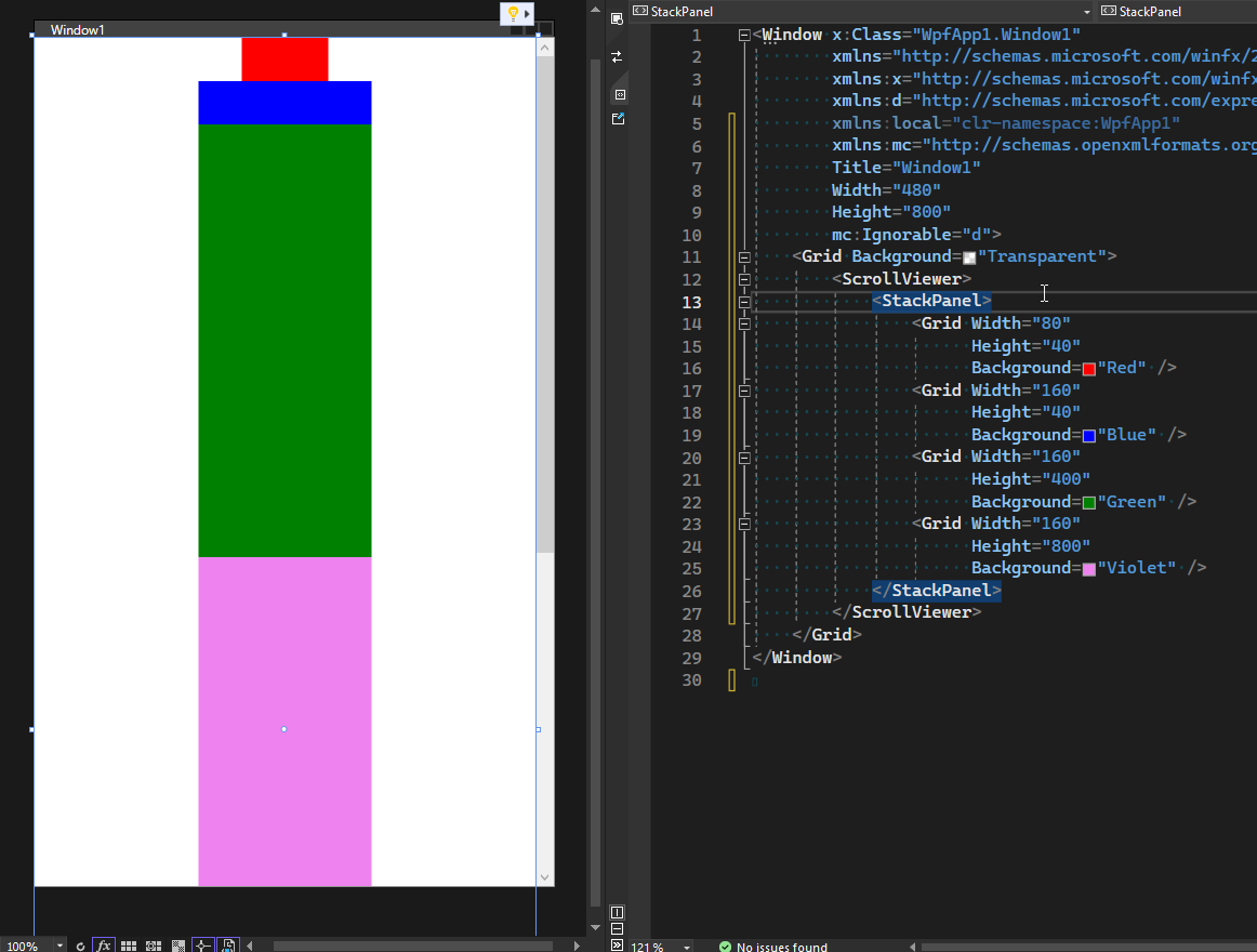
ScrollViewer allow you to scroll the content that overflow the screensize. This apply to both horizontal and vertical size
<Grid Background="Transparent">
    <ScrollViewer>
        <StackPanel>
            <Grid Width="80"
                  Height="40"
                  Background="Red" />
            <Grid Width="160"
                  Height="40"
                  Background="Blue" />
            <Grid Width="160"
                  Height="400"
                  Background="Green" />
            <Grid Width="160"
                  Height="800"
                  Background="Violet" />
        </StackPanel>
    </ScrollViewer>
</Grid>