[Basic for Absolute Beginner] - [Part 1] - Layout with XAML
Over the past while, especially since Nokia has been running a lot of contests with attractive phones as prizes, many of you have PM’d me asking about basic questions on the UI controls in Windows Phone.
This post will give you a general idea of the UI and how to use it when programming for Windows Phone

Within the scope of this post, I will introduce the most basic things about the UI in XAML
In the same series:
[Basic for Absolute Beginner] – [Part 1] – Layout with XAML 1
[Basic for Absolute Beginner] – [Part 2] – Layout with XAML 2
[Basic for Absolute Beginner] – [Part 3] – App’s Structure and how to customize it
[Basic for Absolute Beginner] – [Part 4] – Basic Steps for a new app
[Basic for Absolute Beginner] – [Part 5] – Analytics for your apps
[Basic for Absolute Beginner] - [Part 6] - Source Control
Table of contents
1. Basic Control – Nest Control
In XAML you have 2 main controls used to “hold” other controls: Grid and StackPanel
These 2 controls are quite different, see the table below
| Grid | StackPanel |
|————————————– |——————————————————————- |
| Child controls can overlap each other | Child controls stack vertically or horizontally, they never overlap |
| Can be split into rows and columns | Cannot |
| Expands automatically to fit the control holding it | Expands to fit the content inside it |
Let’s create a new Windows Phone Project and try out what the Grid can do
In MainPage.xaml, take a look at its starting UI.
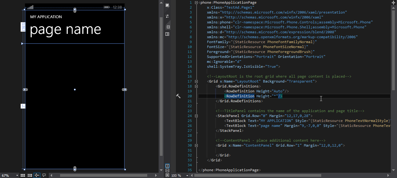
Now go ahead and Delete everything, keeping only the “LayoutRoot” Grid
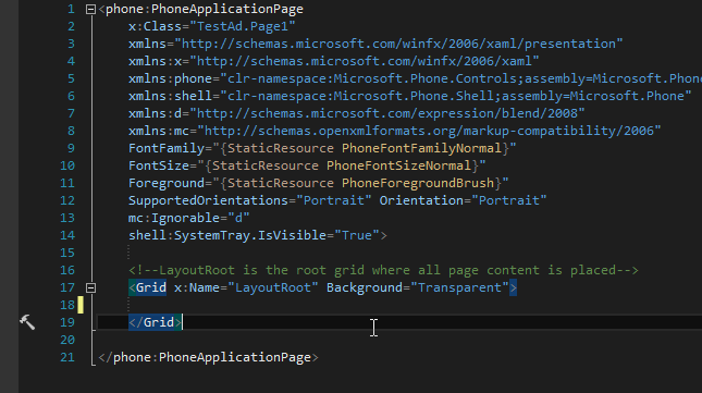
This is the Grid Control. It can hold other controls inside it, and by default those controls overlap each other.
Add the following lines into the LayoutRoot Grid

And notice the change in the UI
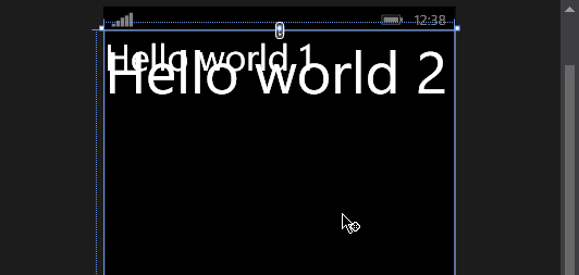
As you can see, these 2 TextBlock lines with different FontSize overlap each other in the UI
Hold on, why would I need this capability of the Grid? I don’t need any controls overlapping each other in my app.
You do: take a look at the picture below
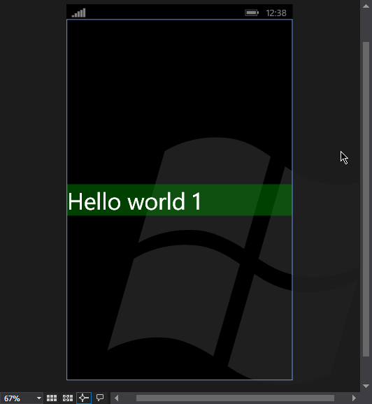
The Windows logo sits underneath, the Hello world text floats on top — pretty nice, isn’t it. I’m sure you will find plenty of even nicer ways to take advantage of this Grid capability
1.1. Grid.ColumnDefinition and Grid.RowDefinition
As shown in the comparison table above, the Grid Control can split the space inside it into several rows and columns
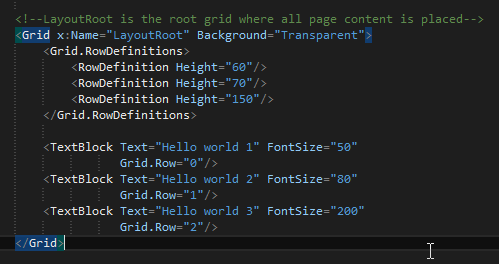
Grid.RowDefinition is the tag that defines how the Grid is split into rows. RowDefinition comes with the Height property. The numbers in the Height property are the Pixels that Row is defined with. The list of Rows is numbered starting from 0
For the child controls inside the Grid, we declare which row it belongs to by adding the property Grid.Row=”row index”
And here is the UI
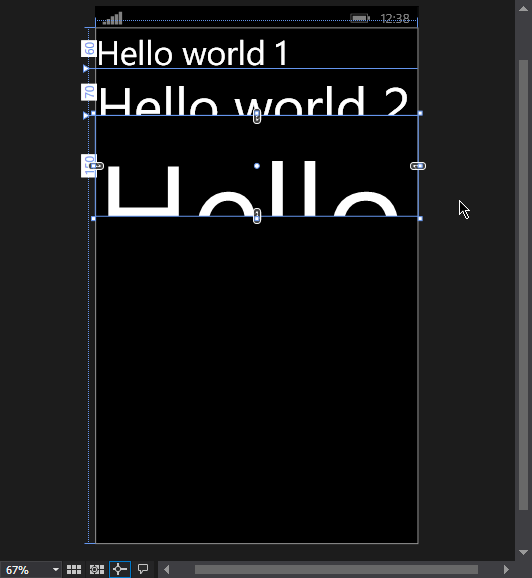
The same goes for ColumnDefinition
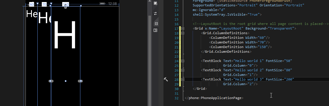
Let’s recap a bit. In the Width property of ColumnDefinition or the Height property of RowDefinition, you will notice that besides setting a number, we can also set it to “Auto” or “*“. What is the difference between those settings?
1.1.1. Fixed Size
Fixed Size is a number. As you see in the picture above, we have 3 columns: column 0 = 60 pixels, column 1 = 70 pixels, column 2 = 150 pixels
That means no matter what you do to the UI, we always have 3 columns with those 3 “measurements”.
What happens when you make the screen bigger — for Windows Phone, when you have a device with a much higher resolution?
For WPF and Silverlight apps, the screen size is not fixed in advance, so when it grows, the 3 columns with those measurements stay exactly the same. Which means you get a very wide black area on the right and 3 columns crammed together on the left
For Windows Phone, according to some MSDN documentation, these 3 columns keep their position — your app is simply scaled up to the device’s resolution.
1.1.2. Auto Size
For an Auto column we get something different. Try changing the first column to Auto and you will see it clearly.
The first column grew to exactly the width of the text inside it, didn’t it? That is what Auto Size is for.
Auto lets you create a column whose width matches the content inside it. But be careful: when the content is too long, the column grows automatically and sometimes runs past the device screen
1.1.3. Star Size
Star Size is a fun one. Let’s have some fun: create a whole bunch of child Grids inside a big grid and see what happens

The first 3 columns each have a fixed size = 50 pixels
The 4th column has Width = “*“ => the 4th column takes up all the remaining width.
Now let’s change the code a little; more interesting things await you

A number in front of the * means shares. 1 + 2 + 3 + 4 = 10 shares, so the first column takes 1/10, the 2nd takes 2/10, the 3rd takes 3/10 and the 4th takes 4/10. No matter how high your device’s resolution is, or what size the parent Grid has, the percentage each column takes stays the same. Great, isn’t it
1.2. Nested Grid – A “Gridception” :3
Let’s have some fun: create a whole bunch of child Grids inside a big grid and see what happens
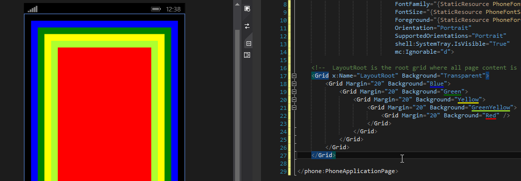
Blindingly colorful. As you can see, a Grid can hold many more Grids inside it, and those child Grids can hold even more child Grids. This is unlimited as long as your device can still render the picture. But I bet you never need more than 5 layers of Grid
2. StackPanel
The StackPanel is quite similar to the Grid in that it can hold many other controls inside it, but the stackpanel cannot be split into rows and columns
Change it as follows
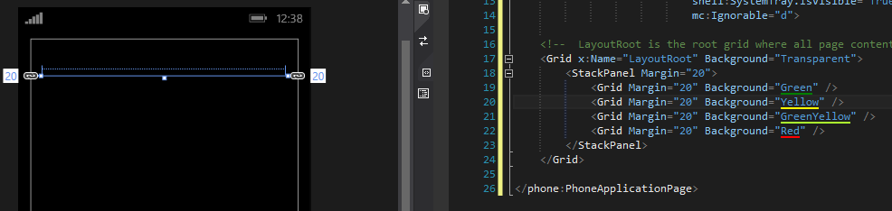
Hold on, where did all the colored Grids go :(
Let’s go back to the nature of the StackPanel
2.1. The nature of the StackPanel
By default, the StackPanel’s width / height is exactly the size of the content inside it.
So the 4 Grids above have no size at all, meaning they get the default size. If those 4 Grids sat inside a big Grid, they would automatically expand to fill the parent Grid. But inside a StackPanel, these 4 Grids shrink down to 0.
By setting a size on each Grid, we see the magic happen

Our 4 Grids now show up, stacked vertically. Now add the property Orientation=”Horizontal” to the StackPanel and change Height to Width

So we can see the StackPanel shrinks as much as possible along its main direction, and expands to fill the parent control along the other one.
2.2. Showing a StackPanel that runs past the screen

I am selecting an object that sits outside the screen.
Adding a ScrollViewer solves the problem
